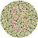
 In an effort to meet accessibility requirements, I was looking for tools to check whether users with a variety of color blindness conditions can actually use our websites. Posters and brochures can already be difficult to read for color blind people. On web sites another dimension is added to this problem because certain features may be rendered useless by choosing a bad color palette. Colored links for example, if not underlined, may not be seen as links because they appear to be of the same color as all other text.
When website accessibility is discussed, the focus is usually on screen reader compatibility and blind people. Accessibility issues caused by a bad color palette are actually much more common. In the USA alone there are 3.5 million people with some form of color blindness. Most have difficulties to discriminate red and green hues („red-green blindness“). A website visitor who cannot see the difference between a red word and a green word will not be happy if these colors are used to markup navigation elements or highlight important content. Checking your website palette for such issues therefore is a good idea.
There are online services that accept a URL and return the corresponding web page with color modifications that match a particular color vision deficiency. The modified page is either returned as a web page or screen shot. A standards compliant page may not be returned in a useful format, as some of these services have only limited CSS support.
Examples:
The Colorblind Web Page Filter
Vischeck Webpages
Other services accept an image file and return its modified version. While this method requires a bit more work to create, save, and upload a screen dump, it produces much more reliable results.
Examples:
Color Blindness Simulator
Vischeck Images
If you prefer to install your own tool, try Colorfield Insight, a Photoshop plugin. There is also free software available to convert web pages into what will be seen by a color blind person. ColorDoctor from Fujitsu works great!
Testing your sites for color related accessibility issues (contrast, brightness, color blindness) is not a low priority thing. It should be part of your regular review and sign-off procedures.